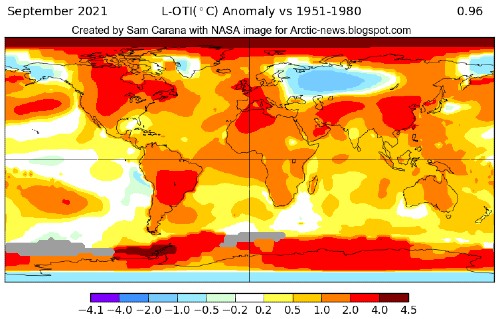
September 2021 was the second warmest September on record, after September 2020, according to NASA, Copernicus and James Hansen, despite the cooling effect of the current La Niña. Above NASA map shows that the Arctic Ocean was hit severely by high temperatures.
from and earlier post
Let's do the calculations once more. The trend in the image below indicates that the NASA data need to be adjusted by 0.29°C to change the base from 1951-1980 to 1900.

- The green trend is based on unadjusted NASA data (1951-1980 base).
- The lilac trend is based on data adjusted by 0.79°C for a 1750 base, for higher polar anomalies and for ocean air temperatures. The lilac trend shows that the 1.5°C threshold was already crossed when the Paris Agreement was adopted in 2015, while a 3°C could be crossed well before 2050.
- The red trend is based on data adjusted by 1.28°C, adding an extra 0.49°C to the lilac data for a 3480 BC base. The red trend shows that the 2°C threshold was already crossed when the Paris Agreement was adopted in 2015, while a 5°C anomaly could crossed by 2060.

The way these adjustments are calculated is also discussed in an earlier post and at the pre-industrial page.
Another thing to consider is the impact of short-term variables. The chart below shows the same red data, i.e. 1.28°C adjusted, with two trends added: a red trend based on 1880-Sept. 2021 data, and a blue trend based on 2015-Sept. 2021 data.
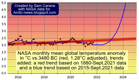
The blue trend is more in line with short-term variables, such as El Niño, sunspots and volcanoes. The blue trend shows that temperatures are currently suppressed.
Within a few years time, sunspots can be expected to reach the peak of their current cycle, and they are looking stronger than forecast, as illustrated by the image below, adapted from NOAA.  Furthermore, the next El Niño could raise surface temperatures significantly. The image below indicates that the difference between the top of El Niño and the bottom of La Niña could be more than half a degree Celsius.
As the image on the right shows, NOAA expects the current La Nina to deepen and to continue well into 2022.
The threatening situation is that we'll go into the next El Niño, while sunspots are increasing and while the aerosol impacts may go from dimming into further driving up temperatures. A huge temperature rise could occur as the sulfates fall away that are currently co-emitted by traffic and industry, while at the same time releases of other aerosols such as black and brown carbon can increase dramatically as more wood burning and forest fires take place. 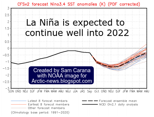
Such short-term natural variability can furthermore act as a catalyst, causing numerous feedbacks to kick in with ever greater ferocity.

Such feedbacks can result in collapse of Arctic sea ice and eruption of huge quantities of carbon dioxide, methane and nitrous oxide, further driving up the temperature rise abruptly, as illustrated by the blue trend.
Sadly, the IPCC appears to have dramatically underplayed the gravity of the situation. The image below, from James Hansen, shows the gap between RCP 2.6 and added forcing since 1990.

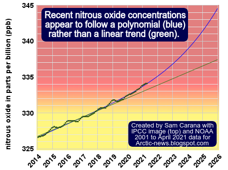
The image below, from Tian et al. (2020), shows differences between the RCP and SSP pathways for nitrous oxide.

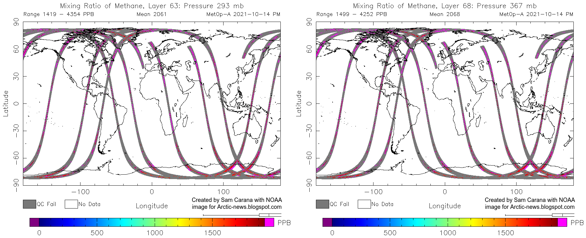
Perhaps even more frightening is the situation regarding methane, as illustrated by the combination image below. The MetOp-2 satellite recorded some terrifying methane levels recently. On October 14, 2021 pm, a peak methane level of 4354 ppb was recorded at 293 mb (left panel), while a mean level of 2068 ppb was recorded at 367 mb (right panel). The images show only a partial cover of the globe, so there may be some problems with this satellite, yet it could be an ominous sign of things to come.

Very few methane measurements are available for the Arctic. Measurements are available from only a handful of ground stations, i.e. flask and in situ data at Barrow, Alaska, and flask data at Cold Bay, Alaska, at Ny-Alesund, Svalbard, at Alert, Nunavut, and at Summit, Greenland, while one-off measurements have been taken by vessels and by aircraft, such as at Poker Flats, near Fairbanks, Alaska. Availability of flask data stopped in 1997 at Mould Bay, Northwest Territories, and in 2018 at Tiksi, Russia. Moreover, to monitor methane releases from the seafloor of the Arctic Ocean, it is essential to have more continuous measurements taken at numerous altitudes by polar-orbiting satellites. And of course, taking measurements alone is not enough to reduce the danger.
The magenta color indicates the highest methane levels, with the highest levels first showing up over the Arctic Ocean. When rising up further toward the Tropopause, beyond what the animation shows, even more magenta shows up, with methane moving toward the Equator, as the Tropopause is higher closer to the Equator.
• NASA GISS Surface Temperature Analysis (GISTEMP v4)
https://data.giss.nasa.gov/gistemp/
• Glasgow Climate Change Conference (COP26)
https://unfccc.int/process-and-meetings/conferences/glasgow-climate-change-conference
• IPCC special report on the impacts of global warming of 1.5 °C above pre-industrial levels and related global greenhouse gas emission pathways (SR1.5)
https://report.ipcc.ch/sr15/
• IPCC AR6
https://www.ipcc.ch/assessment-report/ar6/
• Paris Agreement, adopted 2015
https://unfccc.int/sites/default/files/resource/docs/2015/cop21/eng/l09r01.pdf
https://arctic-news.blogspot.com/2015/12/paris-agreement.html
• MetOp satellites
https://www.ospo.noaa.gov/Products/atmosphere/soundings/iasi/
• September Temperature Update & COP 26 - 14 October 2021 - by James Hansen and Makiko Sato
https://www.nature.com/articles/s41586-020-2780-0
• NOAA Monthly Temperature Anomalies Versus El Niño
https://www.ncdc.noaa.gov/sotc/global/202109/supplemental/page-4
• Is the IPCC creating false perceptions, again?
• Feedbacks
https://arctic-news.blogspot.com/p/feedbacks.html
• Climate Plan
https://arctic-news.blogspot.com/p/climateplan.html