The video posted [below] in this space a week ago took a different approach than usual. Rather than giving a relatively detailed overview of one aspect of climate change, last week’s video included many headlines and my interpretation of the headlines and, in some cases, a short look beyond the headlines.
Today, I’m returning to the usual approach in quoting heavily from an article posted on 29 June 2023 by the WFLA news channel in Tampa, Florida, USA. The article was posted by the Chief Meteorologist and Climate Specialist at WFLA.
My comment on the headline: Duh. Where have you been during the last few decades?
Here’s the lede, which is addressed from the perspective of the author: “In my 3 decade-long career being a weather forecaster, and now Chief Meteorologist and Climate Specialist, I have never observed so many of Earth’s vital signs blinking red. Meteorologists and climate scientists all around the world are in awe by the simultaneous literal ‘off the charts’ records being broken.”
The next sentence: “Yes, it’s climate change.”
Two paragraphs later: “So, to be more specific, it’s climate change – with other natural patterns piled on top.”
And then, finally, getting to the point with a buried lede: “With El Niño now in place, we are getting a glimpse of just how far we can force the climate system, with never before observed heights achieved. Many more are on the way for 2023-2024 as El Niño gets stronger and more heat is released into the Atmosphere.”
Many record-setting weather events have already occurred. Many more are on the way. Naturally, this comes as a complete surprise to corporate media outlets.
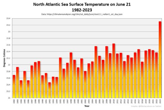
The article from the WFLA news channel then includes four charts to illustrate the point of this story, which, again, includes “off the charts” in the headline. I will introduce and describe each of the four charts. Let’s start with the first graphic in the article titled, “North Atlantic Sea Surface Temperature on June 21, 1982-2023.” As you can see, the North Atlantic sea surface temperature has increased substantially since 1982. After a relatively modest rate of temperature increase from 1982 through 2017, came the triple-dip La Niña event. This triple-dip cooling phase was the first since measurements began about 75 years ago. A substantial spike in the North Atlantic sea surface temperature is apparent during late June of this year, 2023. The stunningly abrupt spike represents about three-quarters of a degree Celsius increase in a single year.
The next figure is introduced with a mention of the aerosol masking effect, albeit not by the name: “The Atlantic has warmed ~2 degrees Fahrenheit since 1900, due to warming from emissions of greenhouse gases due to the burning of fossil fuels and also, more recently, the decrease in air pollution, allowing more sunlight through. In the shorter term, on top of that, we have a weaker Atlantic high meaning weaker tropic low-level winds (trade winds), and thus, less dust stirred up off Africa. Less dust over the Tropical Atlantic skies means more sun gets through and it warms the surface.”
Here I show two graphs taken directly from the article. The first one shows average sulfates and dust for the 20-year period from 2003 until 2022. The second shows the average for these same items, but only for the first 26 days of this June 2023. It is evident that the amount of dust coming from Africa is much reduced this year compared to the previous 20 years. On the other hand, the smoke from this year’s forest fires in Canada is quite impressive.
The third figure illustrated in the article comes from Climate Reanalyzer. It shows world sea-surface temperatures from 1981 until late June of this year, 2023. The profound increase in sea-surface temperatures of the world since March is obvious in this figure.
The final figure included within the story posted by the WFLA news channel in Tampa, Florida is focused on Antarctic ice. Specifically, the graphic illustrates anomalies in Antarctic sea ice from 1979 until late June of this year. As you can see, the modest decline in Antarctic sea ice from 1979 until 2016 has been overwhelmed by the data from the first half of 2023. The red line shown in this figure indicates that we have red-lined sea-ice losses in the Antarctic region.
The article then goes on to discuss other matters, beginning with global sea ice. Not surprisingly, it’s at an all-time low for this time of year. Of course, satellite records only go back to 1979, so we have a bit more than 40 years of records for sea ice.
On the other hand, records go back much further with respect to wildfires. It’s still early in the fire season for North America, but the Canadian fires are making the news on a frequent basis. In addition, Canada has already experienced its worst wildfire season ever in terms of area burned, fire size, and fire intensity. The persistent heat dome parked over much of Canada for several months this year has led to hotter, drier weather than is customary. The result is a stunning indication of fire size and intensity.
I’ll focus on only one more figure from the paper published 29 June 2023. It shows the total annual wildfire carbon emission for Canada from 2003 until this year. Or, as I ought to say, until the first half of this year. As you can see, the greenhouse-gas emissions from the first half of this year blow away wildfire-induced emissions during previous years. In fact, the wildfire carbon emissions for the first half of this year are almost equal to that of Canada’s normal greenhouse gas emissions for an entire year.
Here’s the final paragraph from this article, with a reminder that it was published in a corporate-media outlet: “The bottom line is, with Earth’s overheated climate and an intensifying El Niño, we can expect to see the Earth’s climate system astonish us over and over again into next year.”
Well, of course we can. After all, corporate media outlets such as the WFLA news channel in Tampa, Florida have been focused almost completely on distracting and dividing the masses rather than informing us about the reality of the climate emergency. It’s tough to turn around a fast-moving truck without some advance notice. With respect to abrupt, irreversible climate change, we’re on a runaway train that’s headed for a cliff. Worse yet, essentially nobody is telling us about the cliff, or even about the train we’re on.
Author
"Dr. Guy McPherson is an internationally recognized speaker, award-winning scientist, and the world’s leading authority on abrupt climate change leading to near-term human extinction. He is professor emeritus at the University of Arizona, where he taught and conducted research for twenty years. His published works include 14 books and hundreds of scholarly articles. Dr. McPherson has been featured on TV and radio and in several documentary films. He is a blogger, cultural critic, and co-host of his own radio show “Nature Bats Last.” Dr. McPherson speaks to general audiences across the globe, and to scientists, students, educators, and not-for-profit and business leaders who seek their best available options when confronting Earth’s cataclysmic changes." source


